Bowi Croqueta
Services
Brand Strategy
Naming / Brand claim
Brand Identity
Art Direction
Ecommerce
Colabs
Photography: Bacon Studio
The project’s challenge was to create a new brand & concept for home delivery gourmet croquettes:
Top quality products to claim for, made in a small family owned business focused on gourmet croquette production for hotels and catering supplies. Covid19 twisted their business as happened to manies with an imperious need to diversify their sales channel from B2B to B2C through an ecommerce website.
On the initial briefing, we highlighted three requirements:
Escape from a classic gourmet products brand concept Build up a brand narrative far from political correctness Give the brand humour avoiding product’s loss of credibility.
Our creative work intent was to recreate the “gourmet” concept for a home delivery gourmet croquette supply.
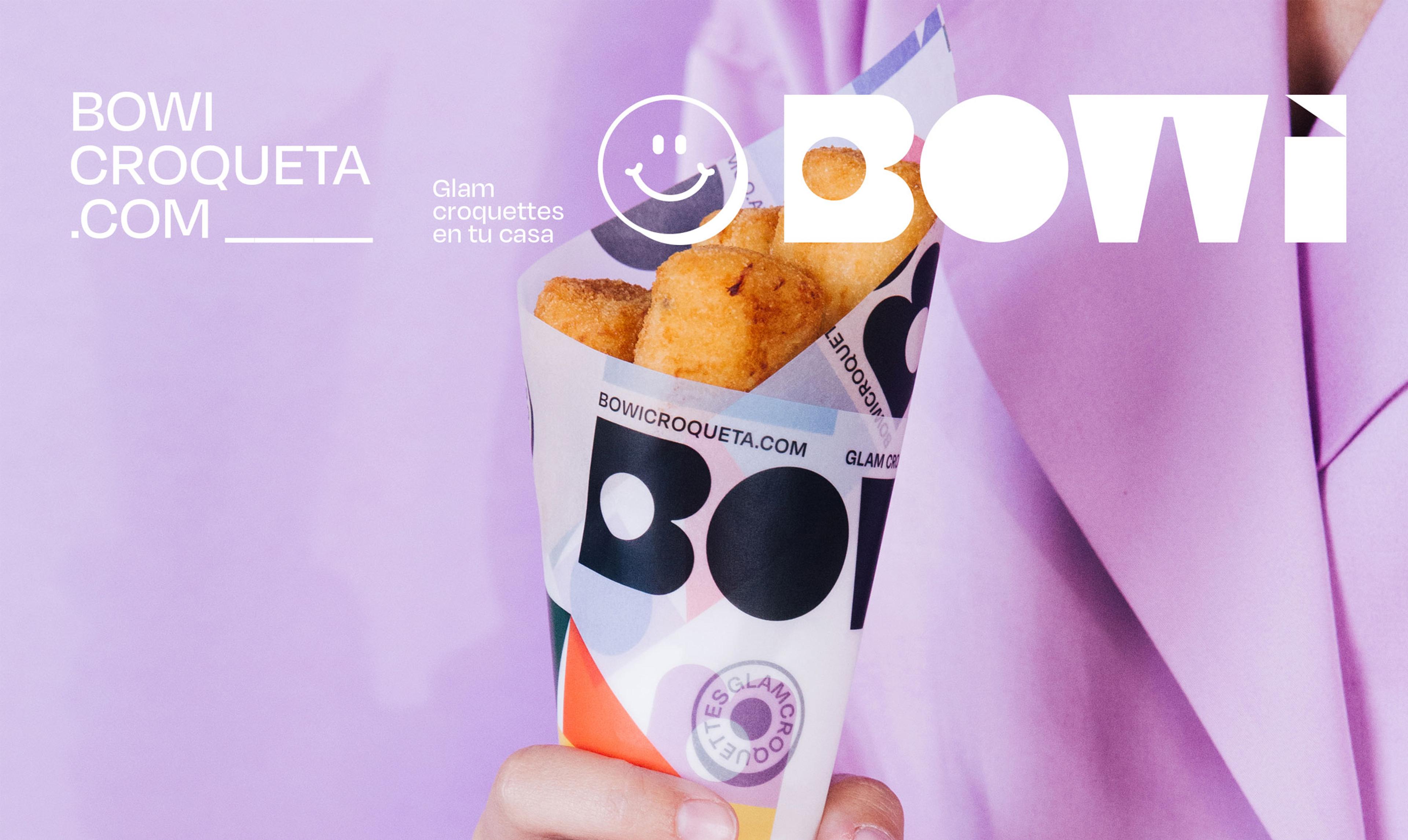
This is how Bowi “Glam Croquettes” was born.
We work on the “Glam Croquettes” claim in order to twist the Gourmet traditional meaning. A “Glam” croquette offers greater flexibility for the brand narrative differentiation goals with fresher and colourful visuals.
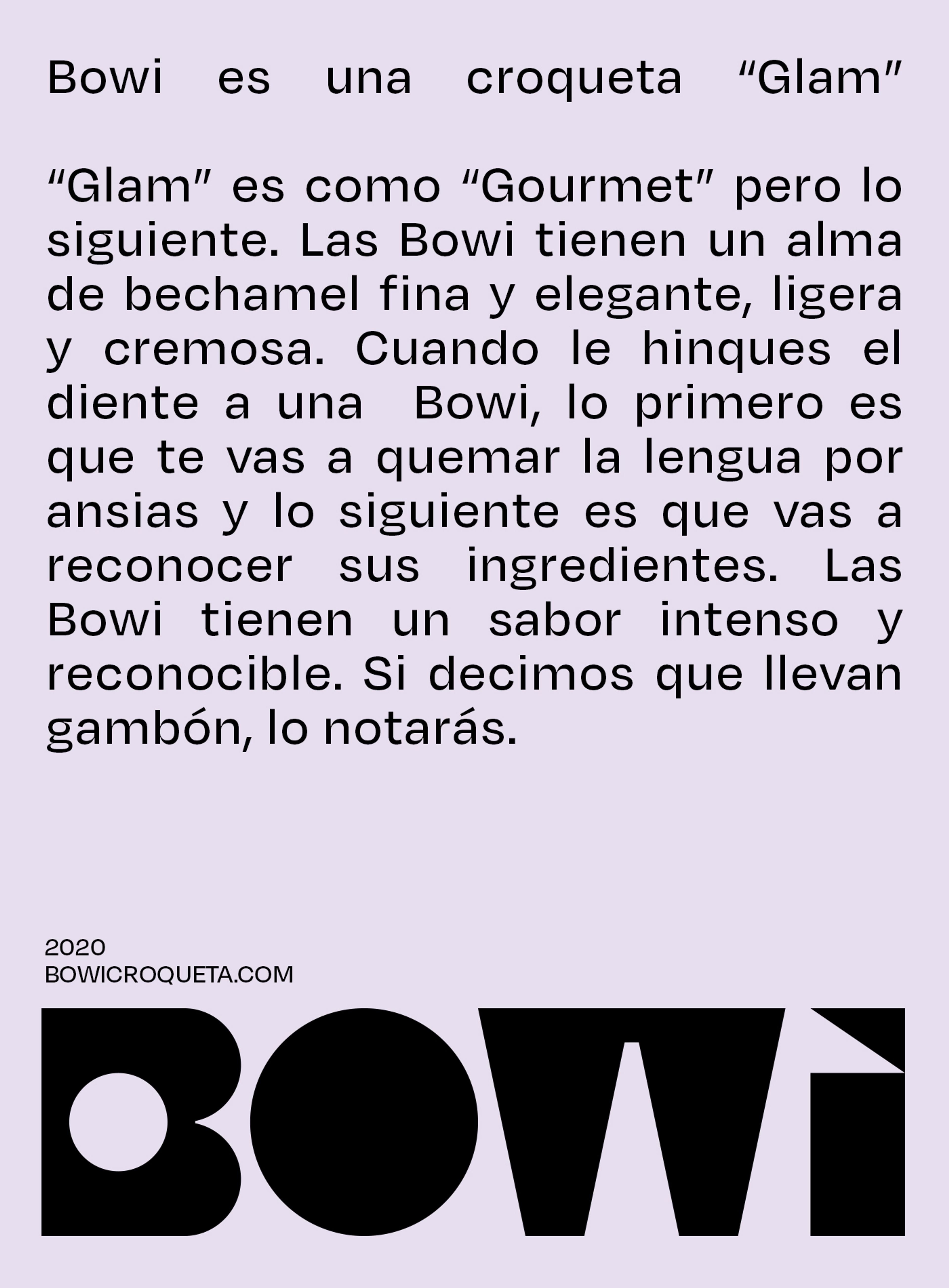
“Bowi” naming was inspired by David Bowie, iconic glam rock king from the 70s/80s, which helps us to strengthen the glam brand concept. “Bowi” is a short, surprising and easy to remember naming that escapes from “croquette” or “gourmet” puns and offers a much more open approach of the product.
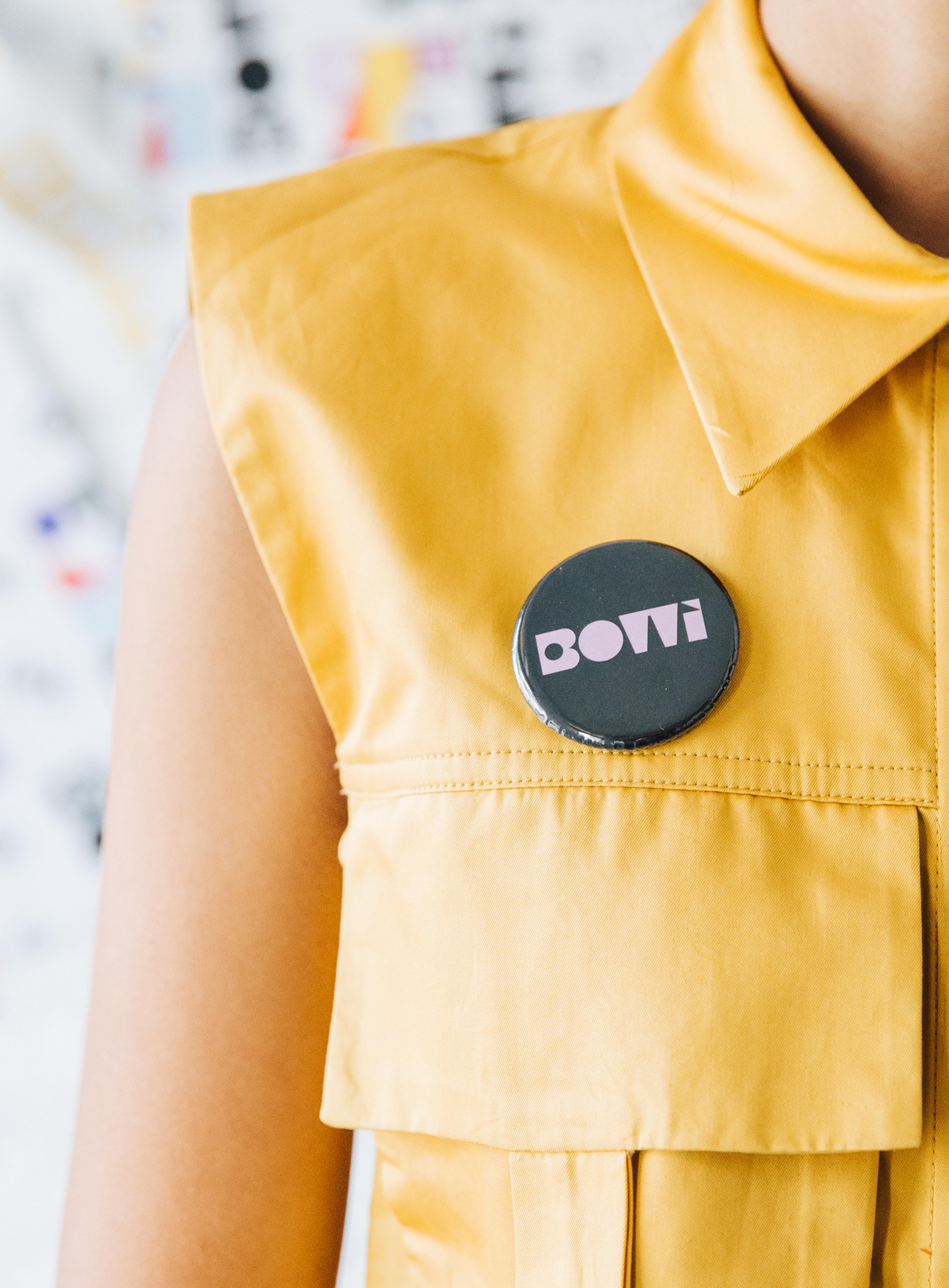
Graphics were based on a logo centered brand visual identity. Logo’s typography is tailor made with geometric character and bold weight in order to offer the brand the possibility to break down each “piece” of it. This graphic resource allows us to create colourful and fun visual options we’ve applied to all the corporate branding elements.


